Apartment Search Website
UX Design / UI Design / Branding / Wireframing / Prototyping
My Role
Lead UX Designer
Timeline
In Development
Overview
I had the unique opportunity to lead and execute the entire UX design process for Stonehenge, a high-end real estate management company. This project required a complete overhaul of their apartment search website, aligning it with their luxury brand while optimizing the user experience. From conducting the initial research to delivering the final product, I was at the helm of every stage, ensuring that the final design not only met but exceeded client expectations. The result was a sleek, user-friendly platform that greatly enhanced Stonehenge’s digital presence.
Key Takeaways
Project Leadership
A two month deadline, because we had to launch before the sunset date.
End to End Ownership
Managed everything from research to final design and implementation.
Impact
Delivered a modern, user-friendly website that significantly improved user engagement.
SOLUTION HIGHLIGHTS
An End to End Revamp of Stonehenge’s Apartment Search
Homepage Search Flow
Greatly improved the landing experience. Giving the users a clear focused journey of finding an apartment.
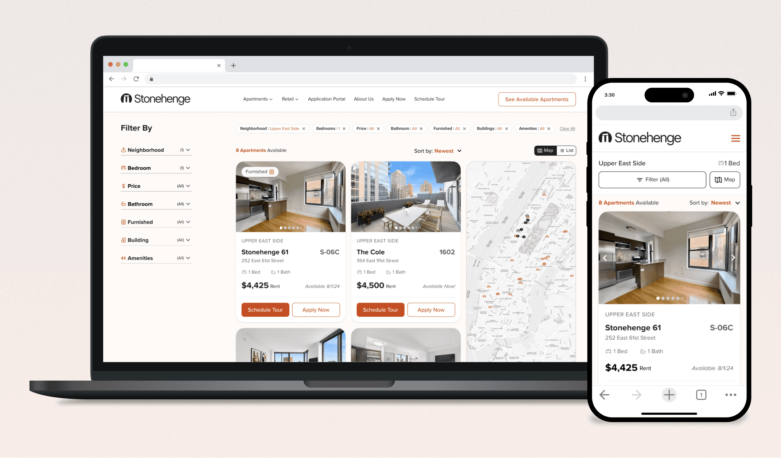
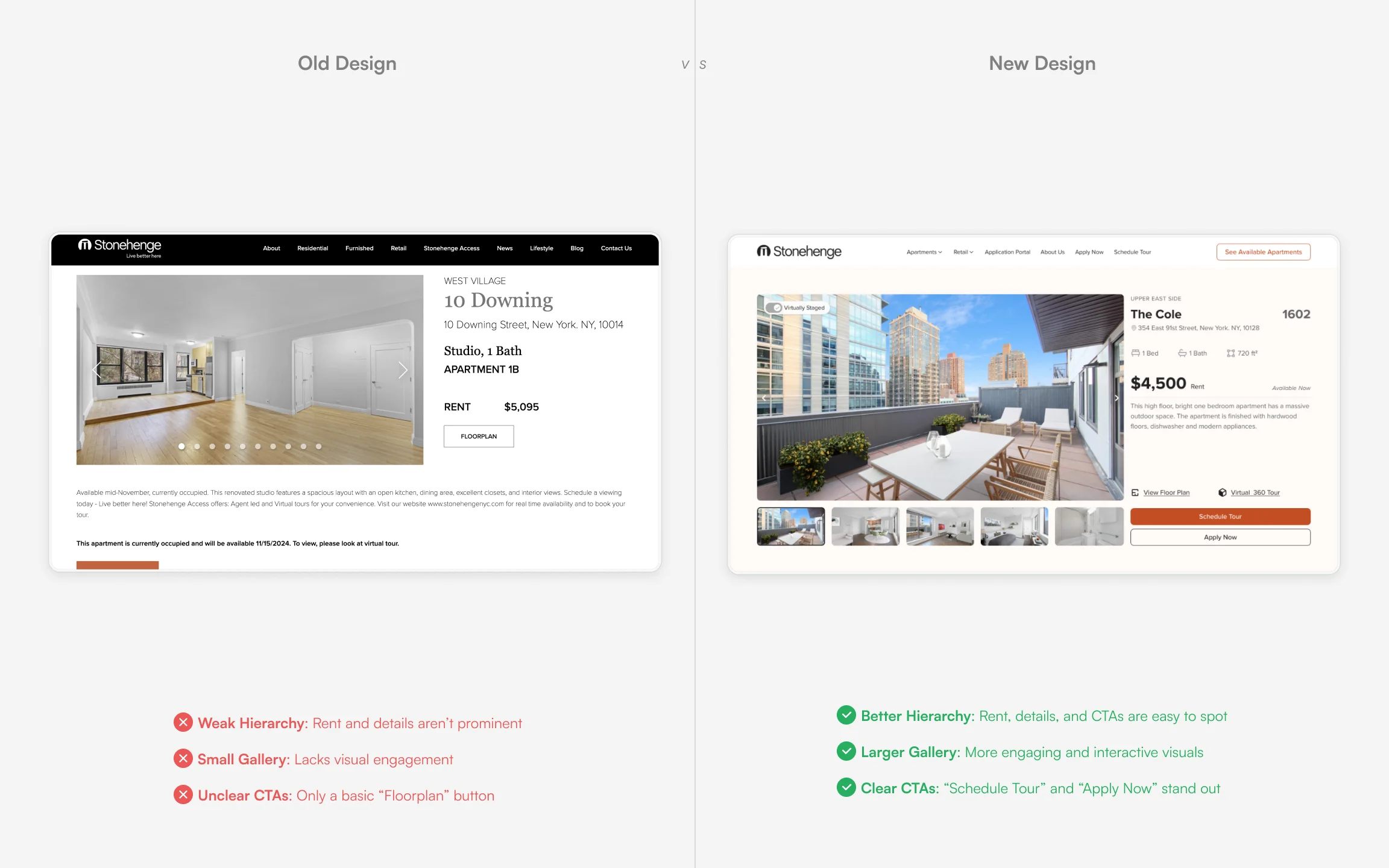
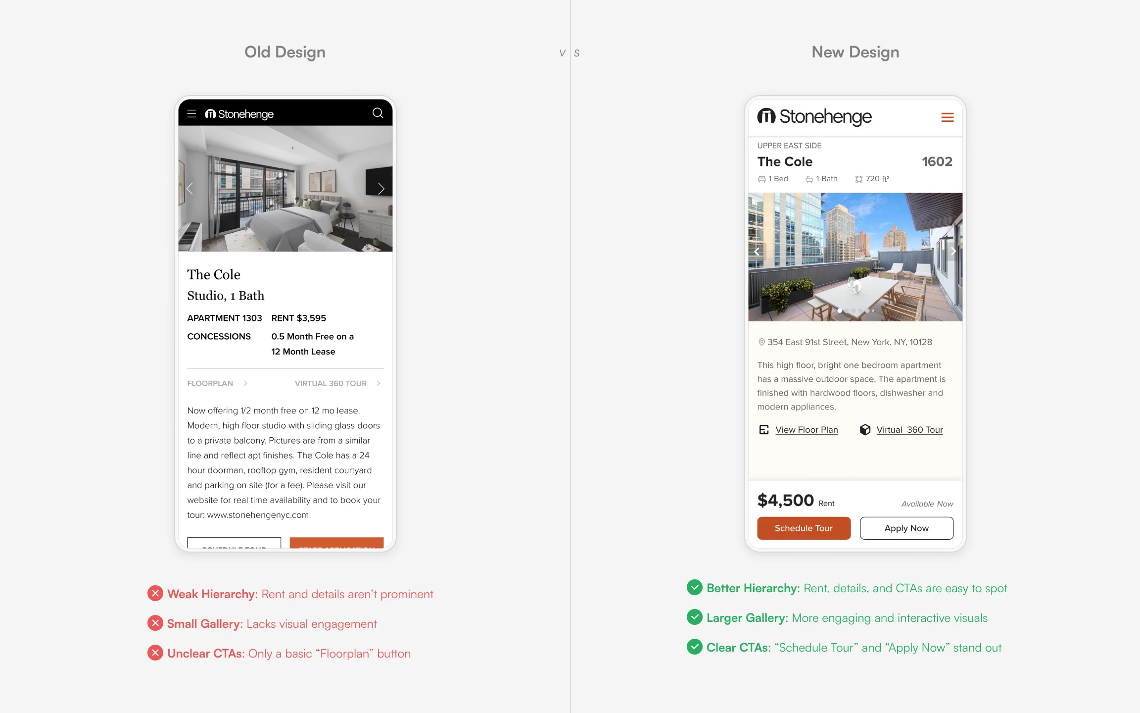
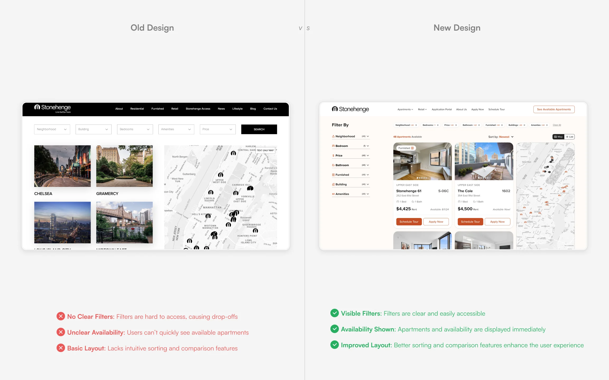
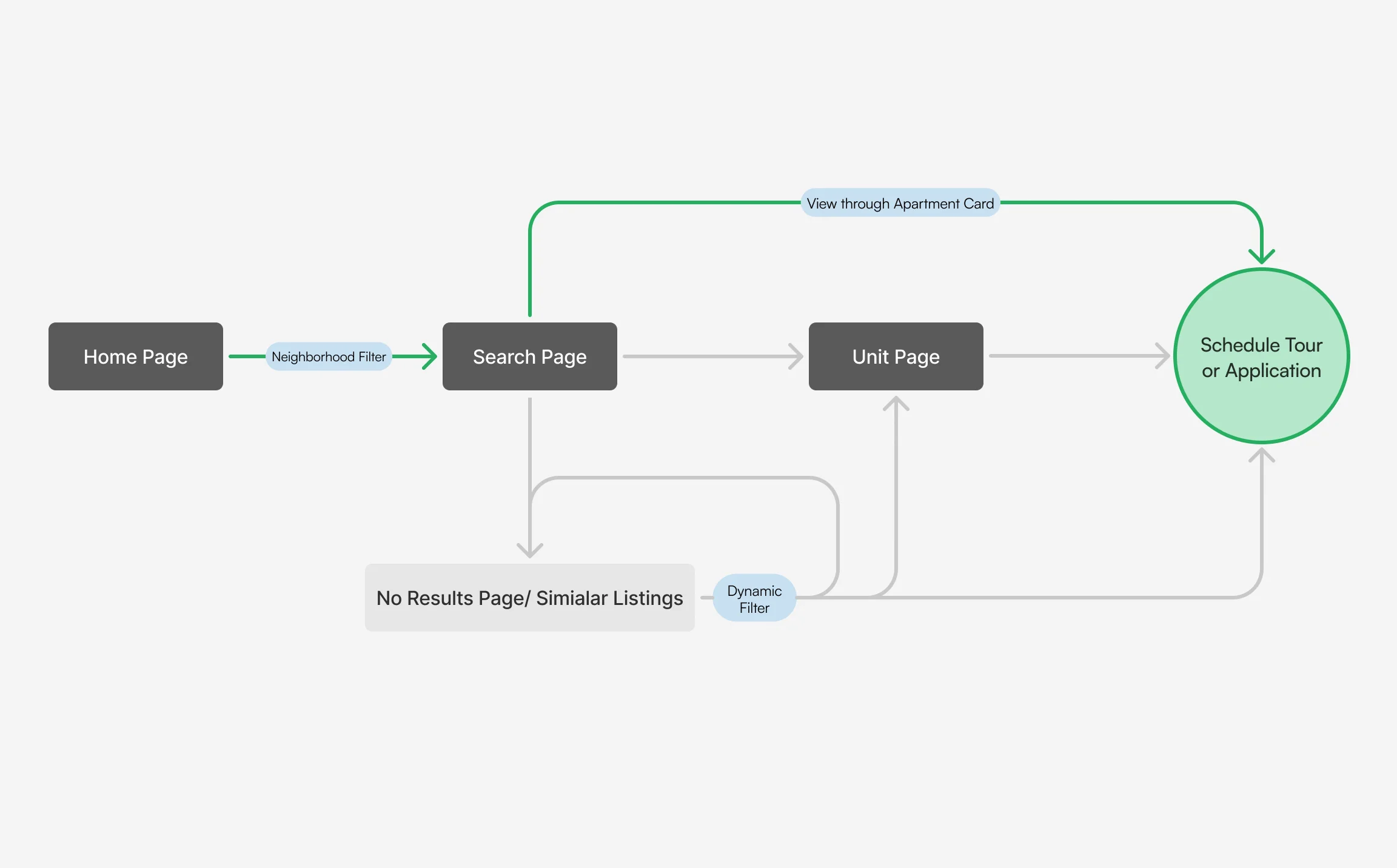
Apartment Search Flow
Allowed users to visuallly navigate apartments and filter apartments down to navigate them towards their ideal apartment.
CONTEXT
Strategic Digital Redesign for Luxury Building Management Company
Deeper Dive
Stonehenge, a leader in luxury real estate management, recognized the need to modernize their online presence. With the renter season fast approaching, they sought a website that would not only reflect their brand’s prestige but also offer a seamless user experience. The project’s objective was clear: deliver a sophisticated, user-centric website that elevates Stonehenge’s digital identity while ensuring an optimal user experience. Using their data in Salesforce we would connect this to populate the website pages.
Heat Maps Of The Old Website
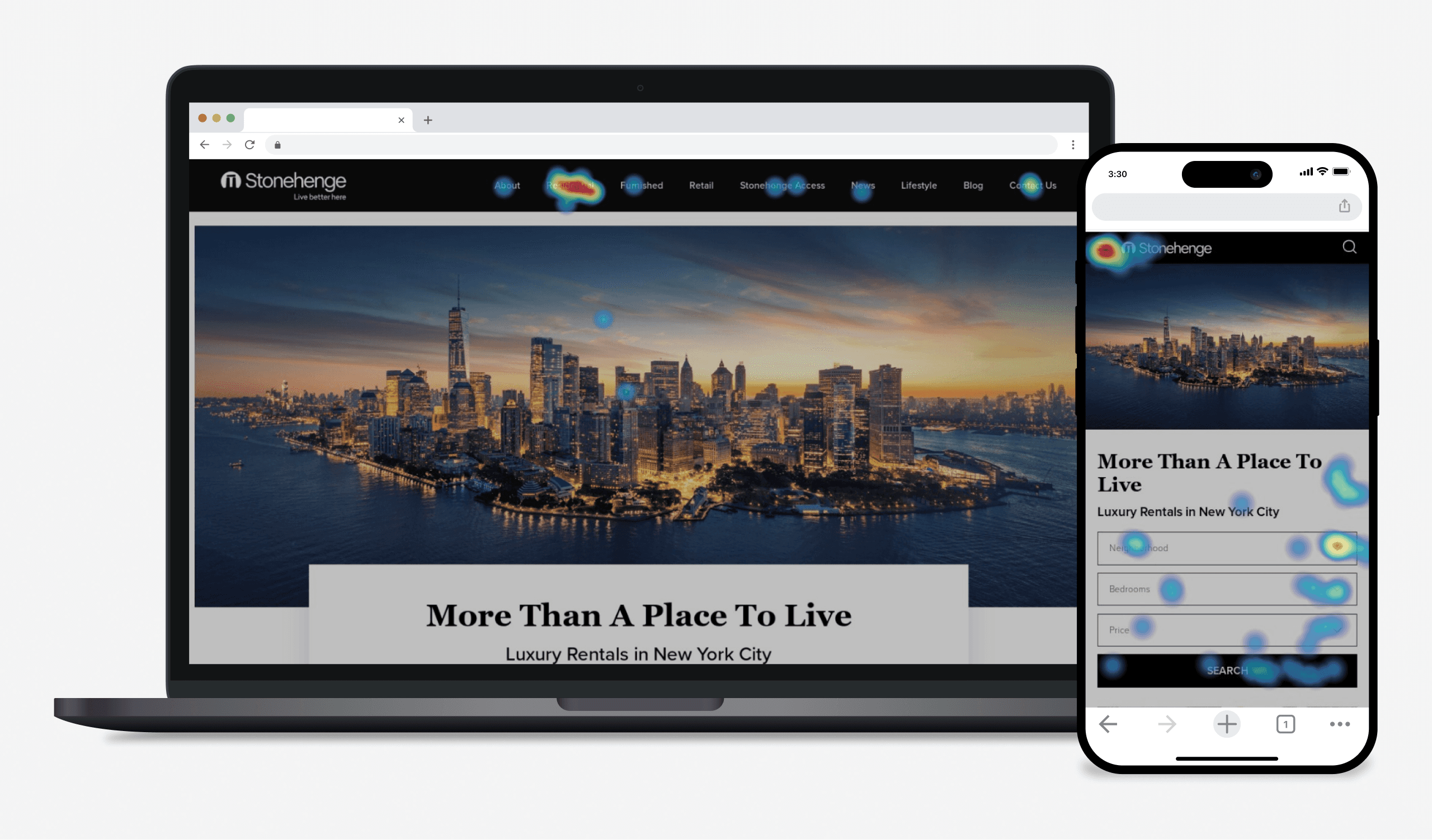
Ran two weeks heat maps to understand user behavior to inform the redesign. There was significant drop off in the existing journey.
THE PROBLEM
Overhauling Stonehenge’s Outdated Apartment Search
UX Improvement Focus
Stonehenge’s previous website was plagued by several UX issues, including a clunky interface, outdated design, and poor navigation. Users struggled to find and filter apartment listings, leading to high bounce rates and a frustrating user experience. My task was to identify these pain points and design a solution that not only resolved these issues but also enhanced the overall user experience while staying true to Stonehenge’s luxury brand image.
Key Issues
Clunky Flow
The original site featured a cumbersome navigation flow that confused users and elongated the property search process, significantly detracting the UX.
Poorly Responsive Design
The website lacked effective responsiveness, leading to poor usability on mobile devices and tablets, which are critical touchpoints for today’s real estate searchers.
Hierarchy Overload
The site’s content hierarchy was overly complex, making it difficult for users to identify key information quickly. This overload hindered decision-making and overall effectiveness.
Old Vs New design
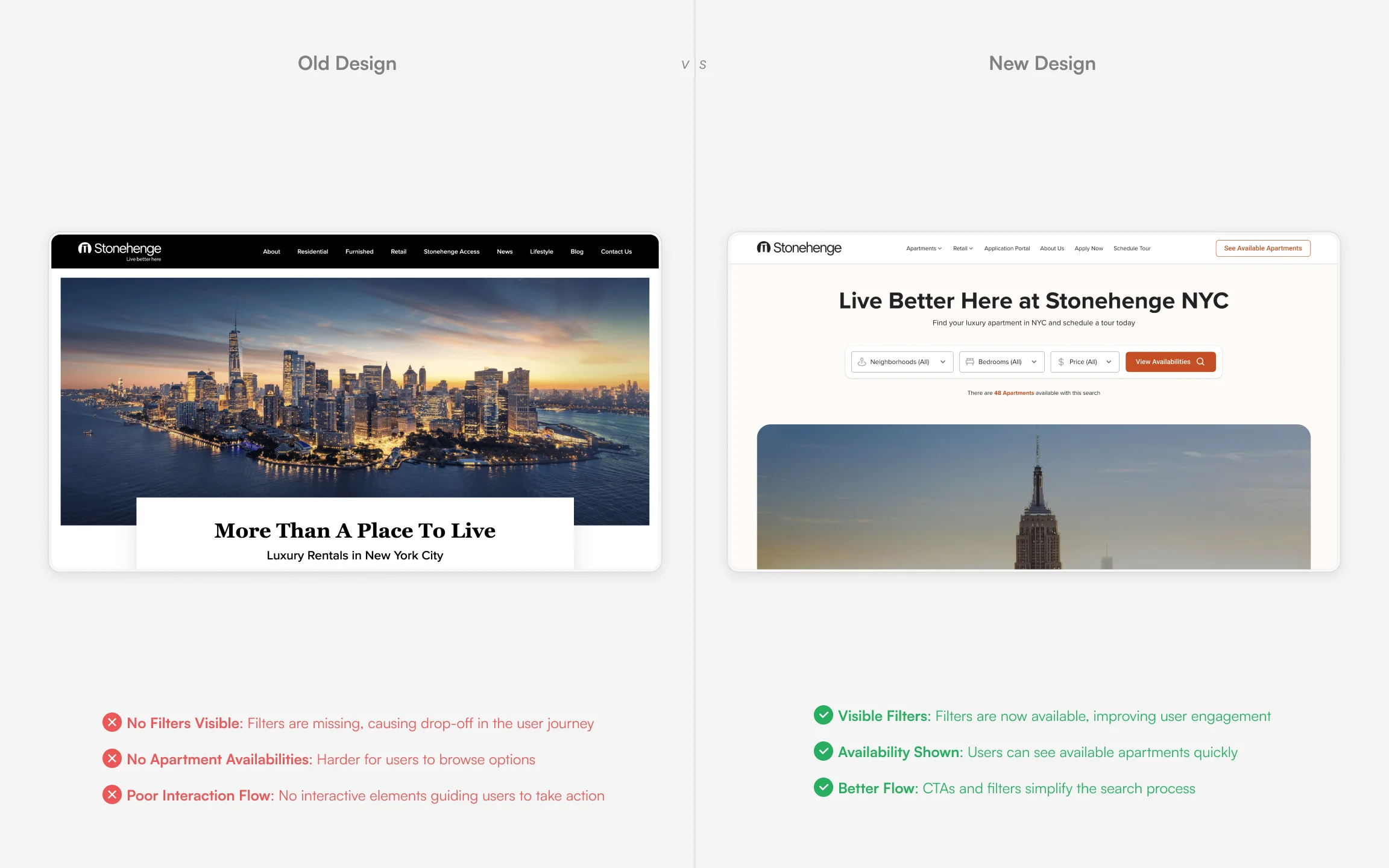
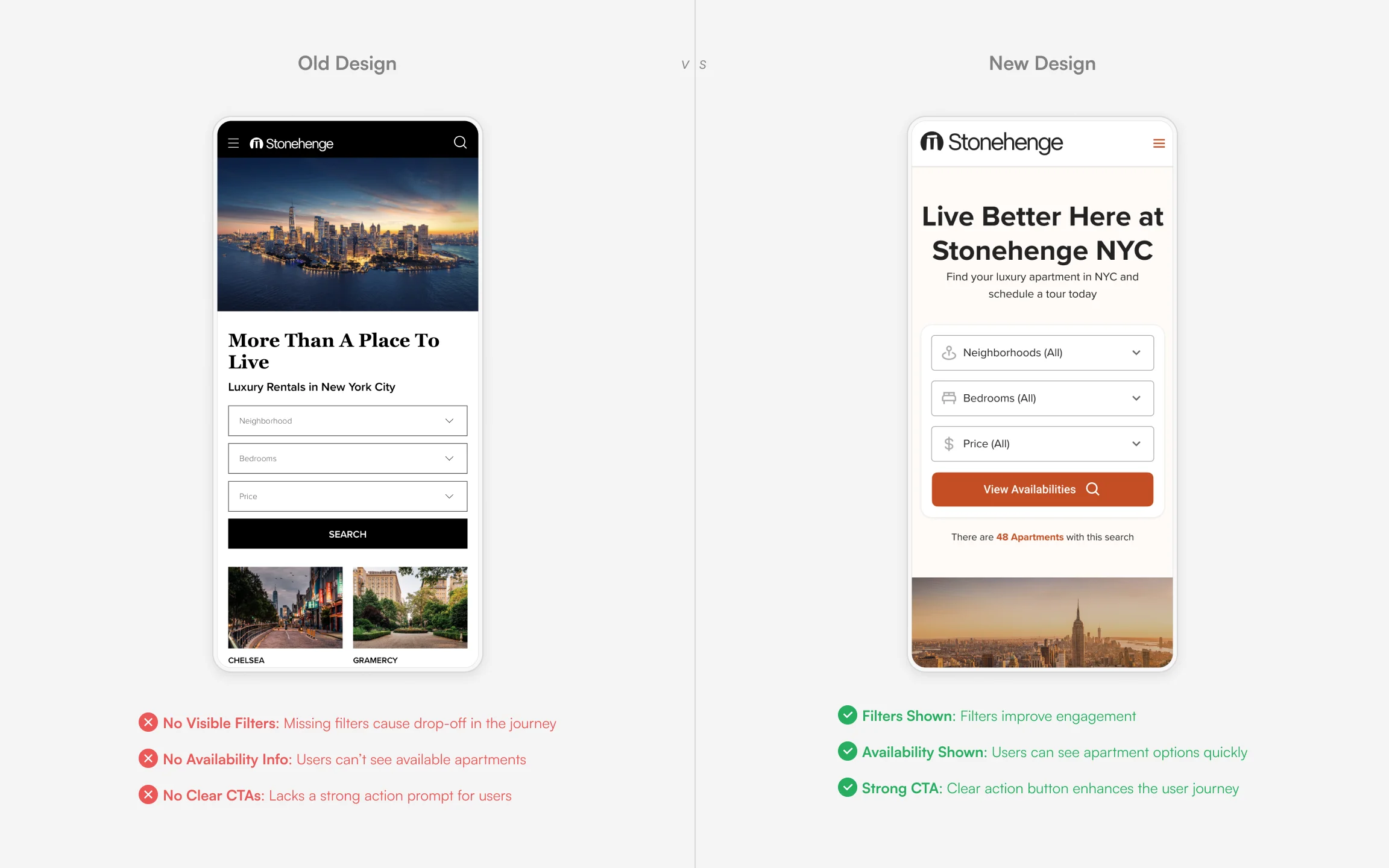
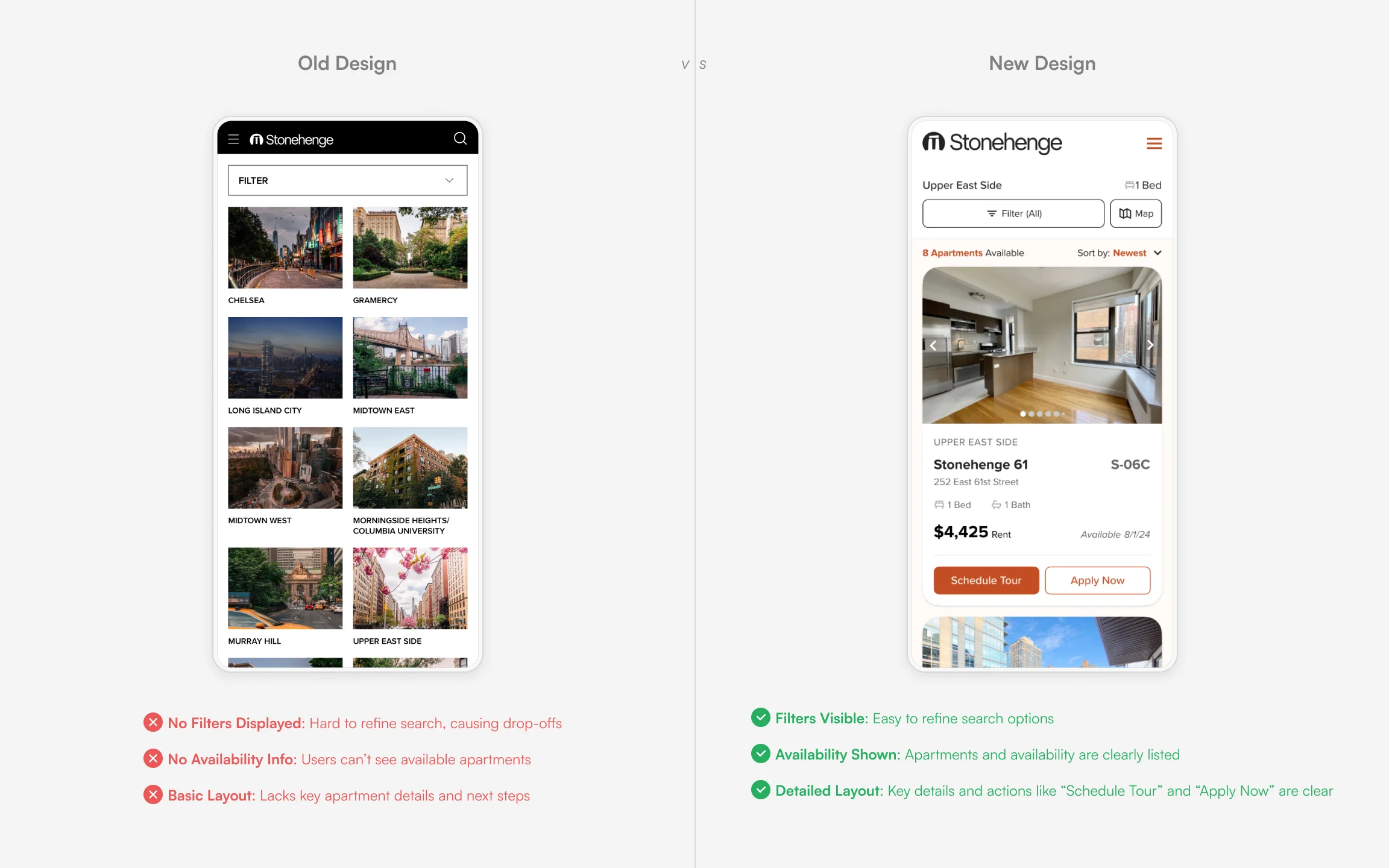
Original search flow with neighborhood filter

There were lots of pain points in the original flow. Things below the fold, multiple clicks, no user feedback, etc.
New search flow with neighborhood filter
Reduce clicks by up to 50% for a user journey using the neighborhood filter, one of the most common filters for NYC apartments.
THE RESEARCH
Insight-Driven Design Behind Stonehenge’s New Website
Foundational Insights
To understand the needs of Stonehenge’s target audience, we conducted a comprehensive competitive analysis, user interviews, and usability tests. This research revealed key pain points, such as difficulty in navigating the site and a lack of clear information about available properties. These insights were crucial in shaping the design strategy, guiding us to create an experience that was not only visually appealing but also highly functional.
Old site map

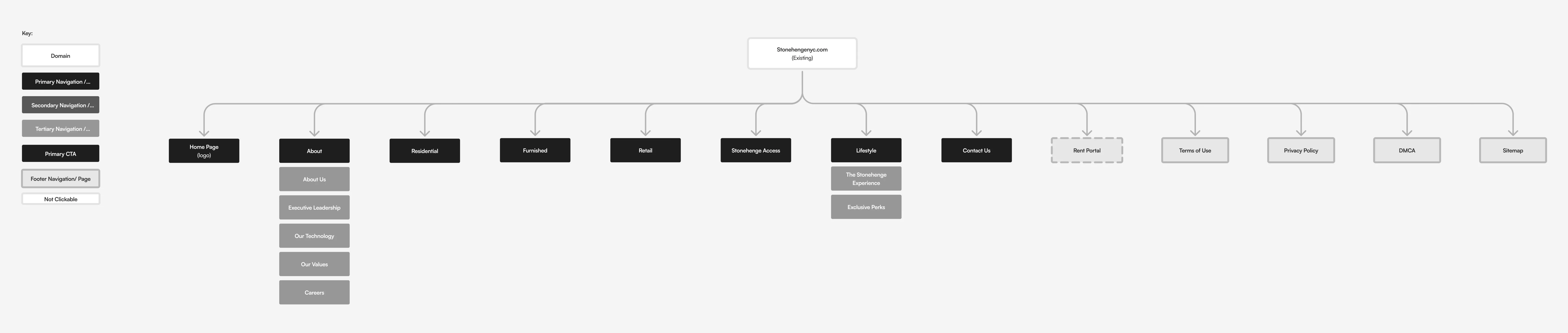
The order and messaging was off for the original nav bar. There was no way to directly access neighborhoods or buildings. There was also a lot of extra "fluff" in the menu that did not truly benefit the user goal: Finding an apartment to live in.
New site map
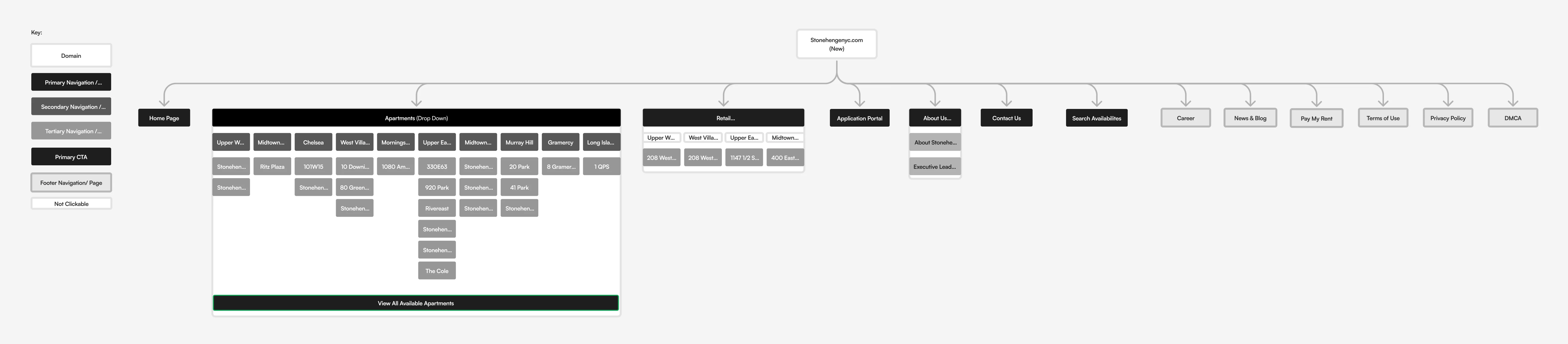
Re-ordered the navigation to display what users were gravitating to on the heat maps. Allowed users to go to neighborhoods and buildings.
VISUAL DESIGN
Systematic Visual Design to craft a Cohesive UX Identity for Stonehenge
Systematic Consistency
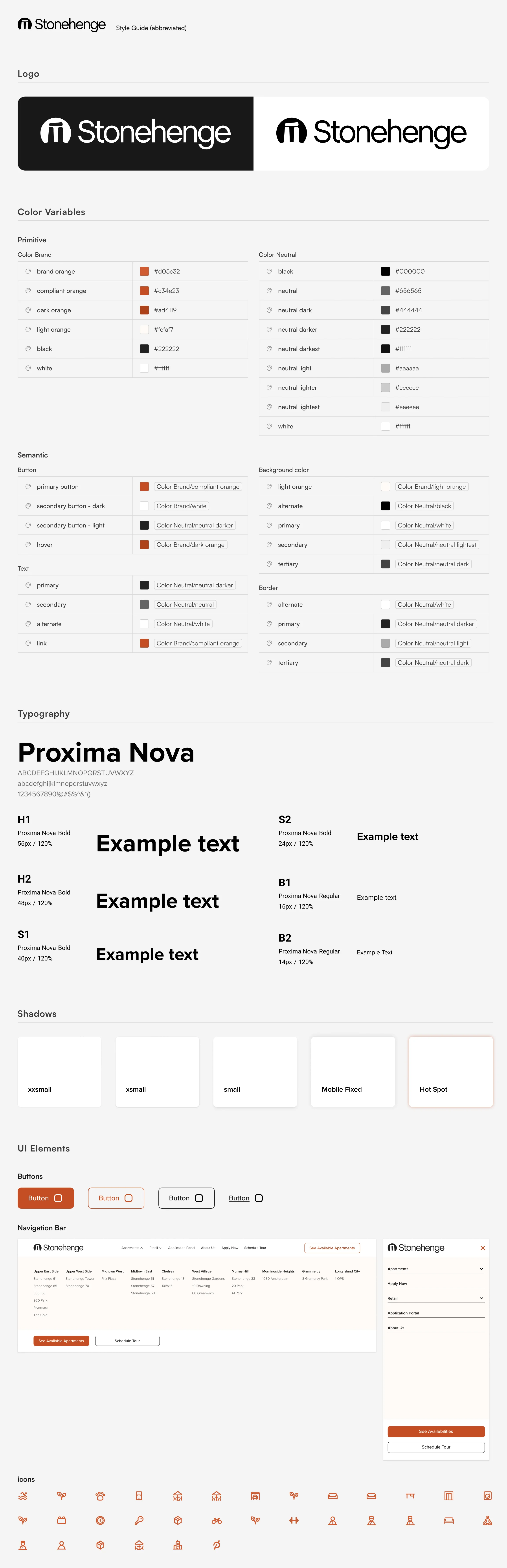
In this project, the design system was not just a backend tool but the foundation of our visual design strategy. By developing a comprehensive design system early in the project, we ensured that all visual elements conformed to a unified aesthetic and functional philosophy. This system included detailed specifications for typography, color schemes, grid layouts, and component styling, which guided the visual design phase. Annotated visuals in this section showcase how the design system was applied in practice, demonstrating the consistency and precision that were crucial in achieving a seamless and visually appealing user interface. Our approach not only enhanced the user experience but also streamlined the development process, making it easier to maintain and update the website.
Key Takeaway
Unified Design Philosophy
The design system merges Stonehenge's luxury branding with functional usability, ensuring a seamless user experience across all platforms.
Scalability and Flexibility
Structured for adaptability, the design system supports seamless updates and scalability, accommodating evolving user needs and technologies.
Detail-Oriented Execution
Meticulous adherence to design system specifications ensures precise visual execution, enhancing readability, navigation, and overall user engagement.
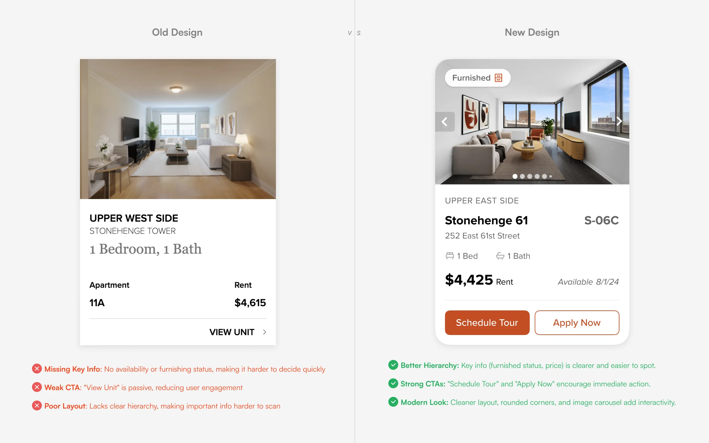
Design System
Annotated card features
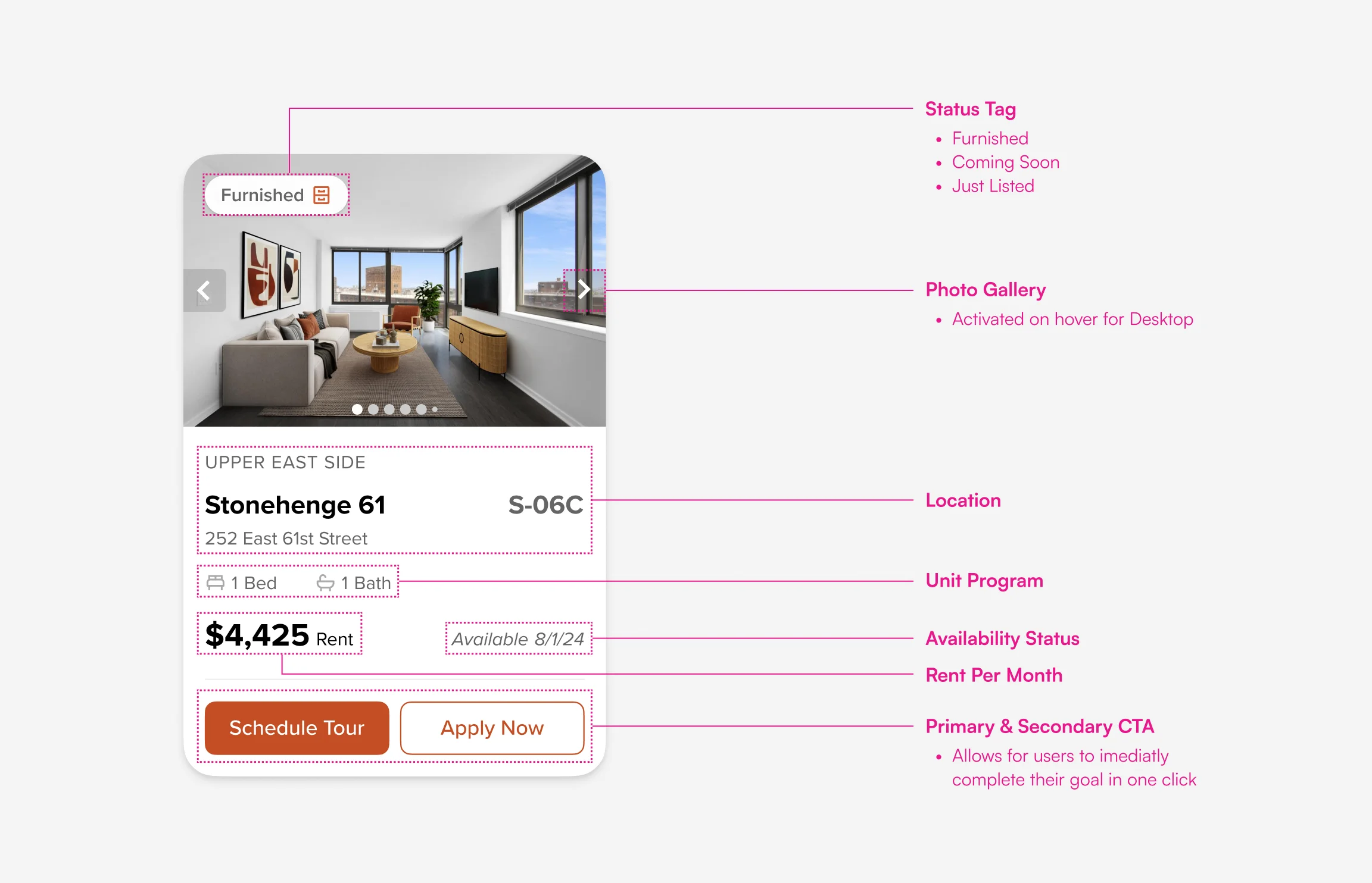
Built out the cards giving users everything they would need to make a decsion on living here.
Pixel and component design for scale
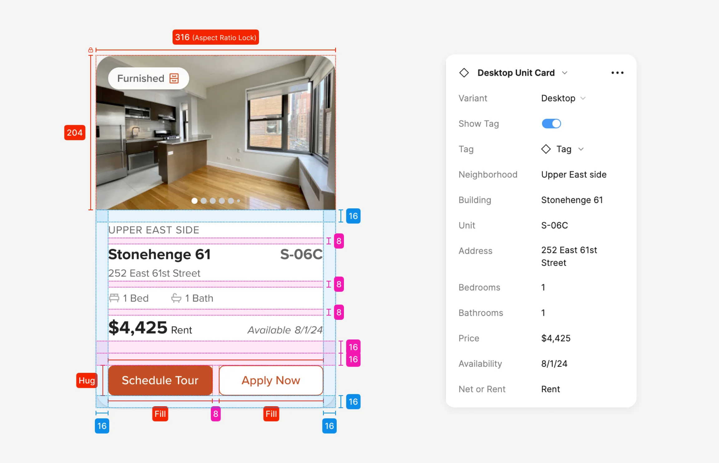
Built out a scalable card component for easy updates and faster development. Carefully crafted using auto lay out and an 8px grid system.
FINAL DESIGN
Delivering a Tailored Solution for Stonehenge’s Renter Season
Optimal User Experience
The final design delivered a modern, responsive, and user-friendly website that met all of Stonehenge’s objectives. Key features include an intuitive search system, a responsive layout, and a visual design that reflects the luxury of their brand. The website is now in develeopment and will be ready, just in time for the renter season, and has since received very positive feedback from the client!
Home Page

Apartment Page

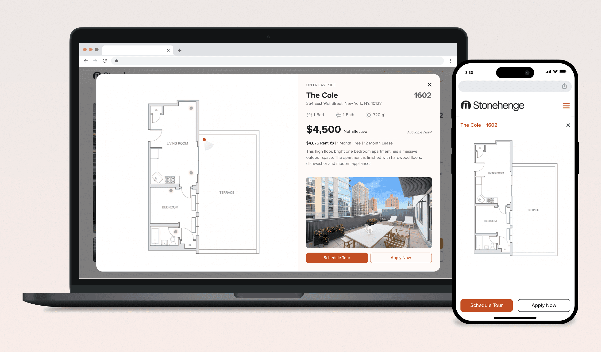
Floor Plan View
Apartment Search Page

Building Page

Commercial Building Page

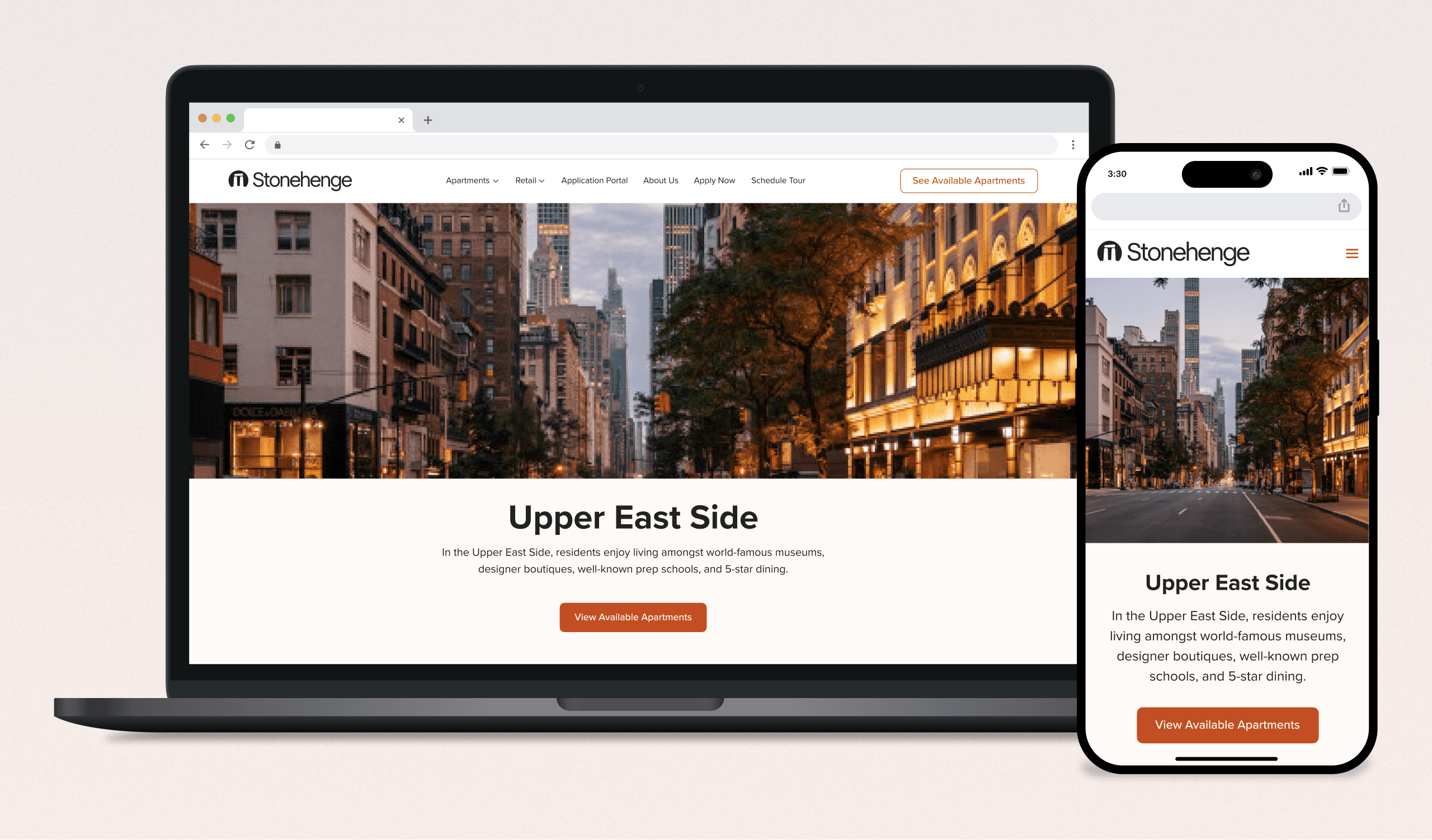
Neighborhood Page
Map Section

RETROSPECTIVE
Navigating the Path To Launch
Development Journey
As we approach the planned launch in late fall 2024, my role has evolved to actively guiding the development of the Stonehenge website using Webflow. This involves a hands-on approach in applying the design system accurately and ensuring that every user interaction is intuitive and effective. Throughout the development process, I have worked closely with developers to make real-time adjustments, ensuring that the site not only looks good but functions flawlessly across all platforms. The focus is on meticulous testing and refinement to deliver a polished final product that lives up to the expectations of both Stonehenge and its users.
Key Takeaways
Active Development Role
Continuously engaged in the development process, ensuring that the design principles are accurately implemented within the Webflow environment.
Ongoing Optimizations
Regularly interfacing with the development team to refine and adjust the user interface and experience based on real-time feedback and technical constraints.
Preparation for Launch
Focused on rigorous testing and final adjustments to guarantee a seamless launch, aimed at optimizing performance and user satisfaction.